Strategic Relocation: Maps
Contents
- 1 Climate (North America)
- 2 Climate (Europe)
- 3 Climate (World)
- 3.1 Map of Average Temperature Change during Maunder Minimum (World)
- 3.2 Map of Winter Temperature Change during Maunder Minimum (World)
- 3.3 Map of Global Average Surface Temperature Change during Little Ice Age (World)
- 3.4 Global Map of Maximum Glacial Coverage c.18 00 - 50 000 years ago
- 3.5 Map of the Glacier, Tundra, Grassland, Jungle, Savanna & Desert Areas c. 20.000 Years Ago (World)
- 3.6 Map of Vegetation and Climate Ecosystem types from last Glacial Maximum (25 000 - 15 000 years ago, 2011) (World)
- 3.7 Map of latitude areas 45°N/45°S and 30°N/30°S and 15°N/15°S
- 4 Risk Maps (North America)
- 5 Risk Maps (World)
- 6 Resource Maps (North America)
- 7 Resource Maps (World)
- 8 Credits / Thanks
- 9 External Links (more maps)
Climate (North America)
Map of Average temperature anomaly (trend) for the past 30 years (North America)
The following NOAA/NCEI Temperature Anomaly Map shows the trend in warming / cooling for the past 30 years (1987-2016). This should be enough of a time to see the potential geographical distribution of cooling in the USA, although it may not fully reflect the actual results of a grand solar minimum changes by geographical location.
Source: https://www.climate.gov/news-features/blogs/beyond-data/mapping-us-climate-trends
_12-2017.png)
- Wind map although, again, per Grand Solar Minimum Symptoms, expect it to be windier, definitely potential for gusty storms
Map North America Maximum Glacial Coverage c.12 00 years ago
The following map shows the maximum glacial coverage from roughly the end of the previous ice age period (12 000 years go) for the North America. Source: http://deeptimemaps.com/north-america-key-time-slices-thumbnails/

Climate (Europe)
Global Map of Maximum Glacial Coverage c.50 000 years ago
The following map shows the maximum glacial coverage now (top map) vs period from the previous ice age period (c. 50 000 years go, bottom map) for Europe. Source: http://deeptimemaps.com/europe-series-thumbnails/

Climate (World)
Map of Average Temperature Change during Maunder Minimum (World)
World Map derived with a computation GCM model for Average Temperature Change Maunder Minimum Average (NASA GISS, 2001).
Source: https://www.giss.nasa.gov/research/briefs/shindell_06/

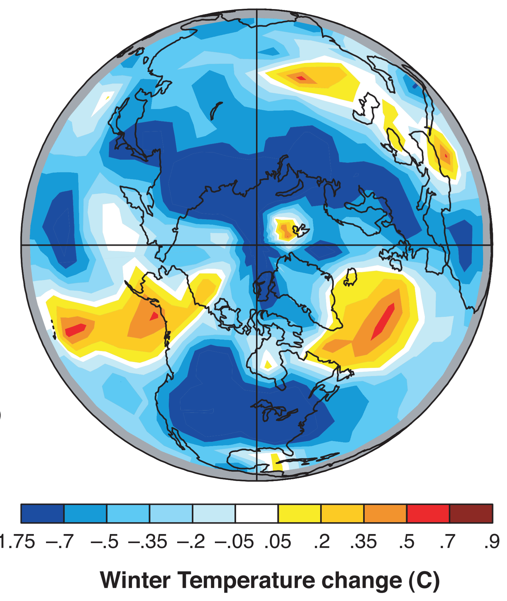
Map of Winter Temperature Change during Maunder Minimum (World)
World Map derived with a computation GCM model for Winter Temperature Change during Maunder Minimum Average (NASA GISS, 2001)
Source: https://www.giss.nasa.gov/research/briefs/shindell_06/
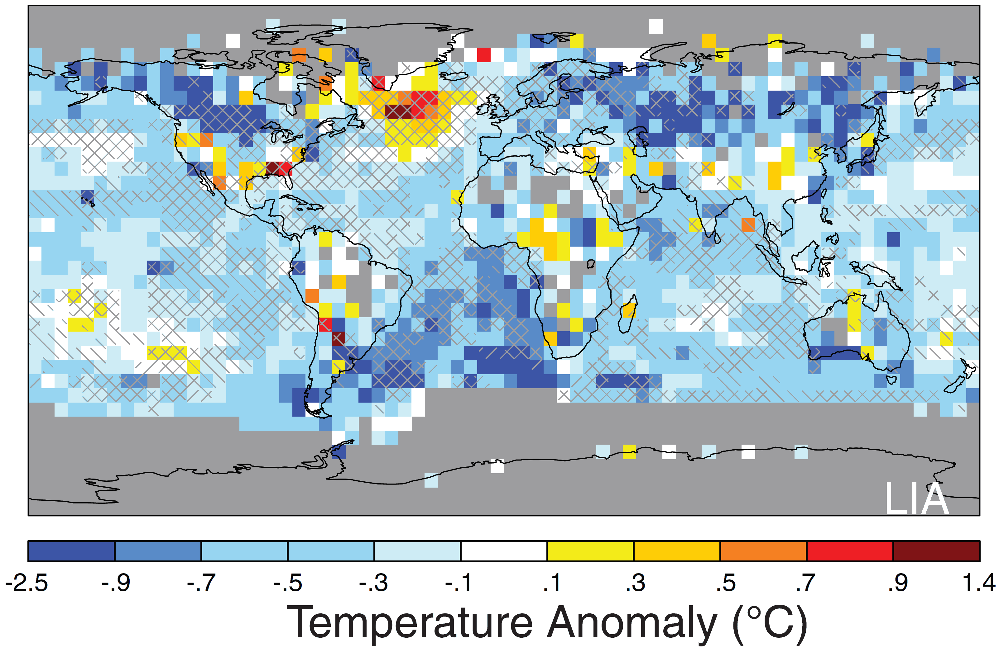
Map of Global Average Surface Temperature Change during Little Ice Age (World)
Map of Global Average Surface Temperature Change during Little Ice Age (1400-1700 compared to period 1961-1990) (SCIENCE, Vol 326, 2009).
Source: http://dx.doi.org/10.1126/science.1177303
Global Map of Maximum Glacial Coverage c.18 00 - 50 000 years ago
The following map shows the maximum glacial coverage from the previous ice age period (18 000 - 50 000 years go) for the world. Source: http://deeptimemaps.com/global-series-thumbnails/

Map of the Glacier, Tundra, Grassland, Jungle, Savanna & Desert Areas c. 20.000 Years Ago (World)
World Map of Glacial Maximum from c. 20 000 years ago, incl. different temperate areas (Glacier, Tundra, Grassland, Jungle, Savanna & Desert) from the time of the previous ice age.
Source: https://land-of-maps.tumblr.com/post/166017667215/world-map-of-the-last-glacial-maximum-c-20000

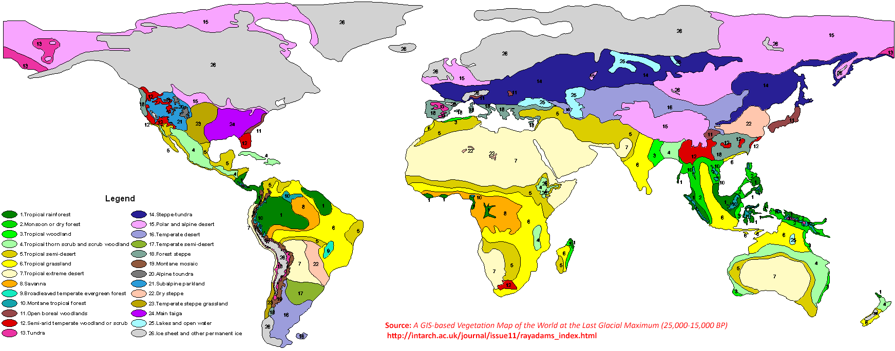
Map of Vegetation and Climate Ecosystem types from last Glacial Maximum (25 000 - 15 000 years ago, 2011) (World)
Reconstructed GIS-based Vegetation and ecosystem map from the last glacial maximum (c. 25 000 - 15 000 years ago) by N. Ray and J.M. Adams.
Source: http://intarch.ac.uk/journal/issue11/rayadams_index.html
Map of latitude areas 45°N/45°S and 30°N/30°S and 15°N/15°S
World map with 45°N/45°S and 30°N/30°S and 15°N/15°S latitudes marked. Some forecasters say that for truly cold grand solar minimum one should stay below 45°N latitude for any kind of sensible temperatures and growing season. Others say below 30°N-35°N.
Of course all this depends on so many factors (wind patterns, precipitation, average temperatures, minimum temperatures, volcanic activity, etc that is is impossible to predict anything for sure).
Also, be aware that in some areas between 30°N/15°S were deserts during the last glacial (ice age) maximum.
Risk Maps (North America)
Wildfires

Flooding
See FEMA's Flood Map Service Center
Population


Evolving mega cities:

Tornado
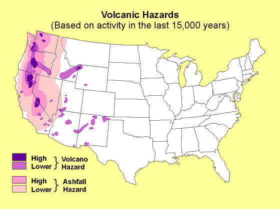
Volcano
Seismic / Earthquake Hazards
Seismic activity hazard map from USGS (2014). Source: https://earthquake.usgs.gov/hazards/hazmaps/conterminous/
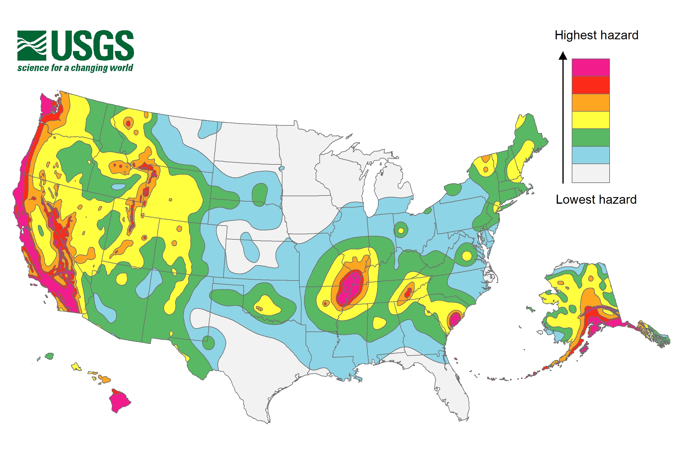
Most recent earthquake hazard map, including natural as well as human-induced earthquake hazard zones (USGS 2015) :

Risk Maps (World)
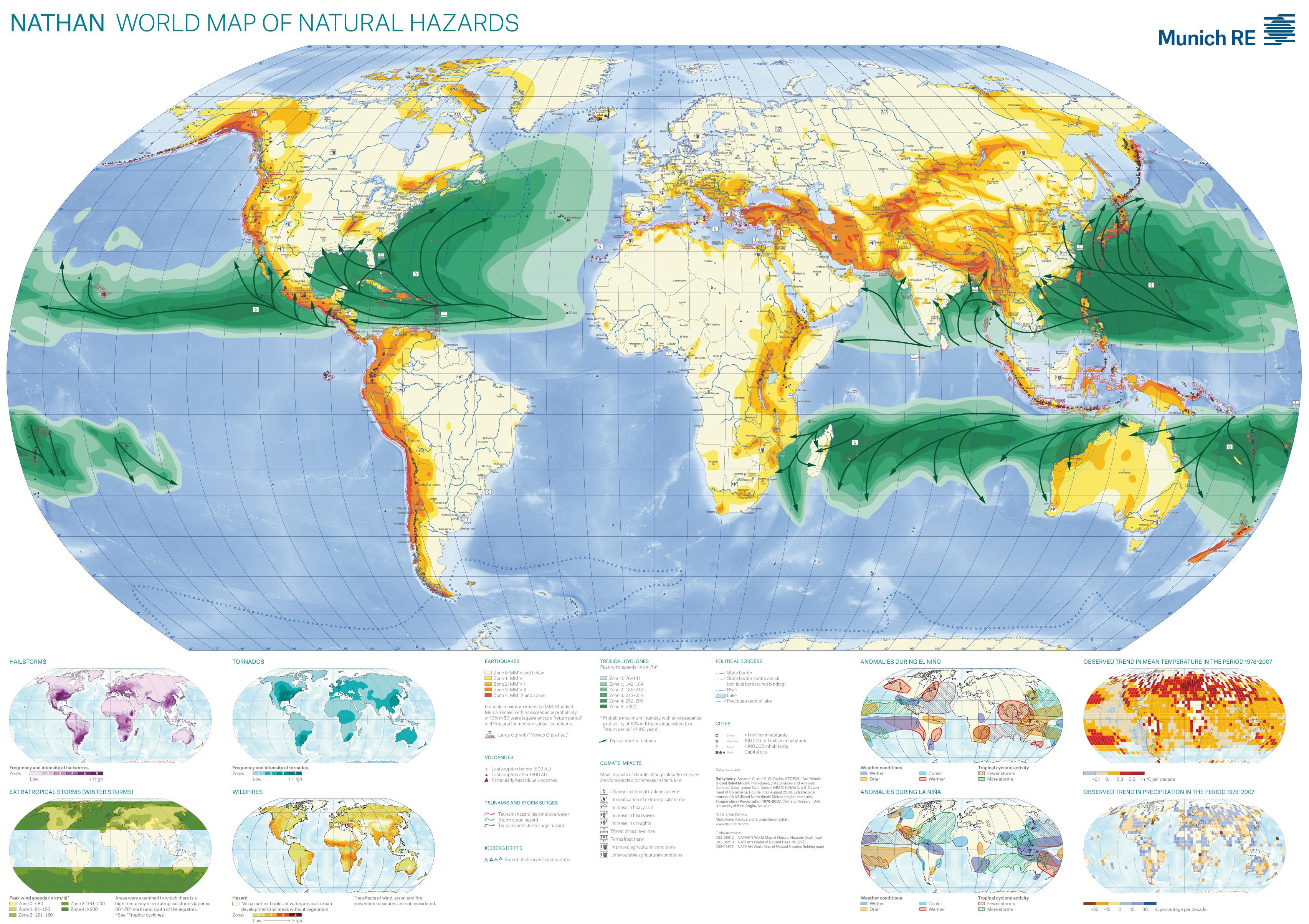
Natural Hazards (World)
Natural Hazards Map from insurance company Munich RE, including Storms, Earthquakes and Volcanoes. (date 2011, data up to 2007). Later versions available only at: Source: http://nathanlight.munichre.com/
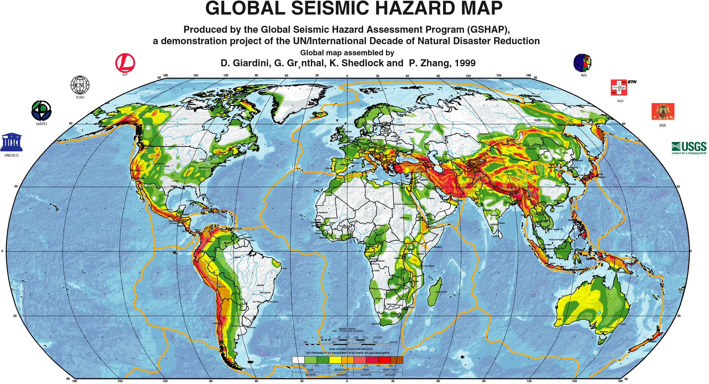
Seismic Events / Earthquakes (World)
Glomap Map of Seismic Hazards from Global Seismic Hazard Assessment Program (GSHAP), 1999.
Source: http://static.seismo.ethz.ch/GSHAP/global/
Resource Maps (North America)
Water
The following USGS website, Real-Time Groundwater Data, lists many locations within each state and the approximate depth to which you may have to drill to reach groundwater. A few extreme depths are located in parts of Nevada at depths greater than 800 feet while other locations are only 10’s of feet.
The following map shows the location of all the aquifers of the United States. If you are choosing a ‘retreat’ relocation, you may find it desirable to live as close as possible to a good water source, or above an aquifer – as water becomes more of a valuable commodity in our future.
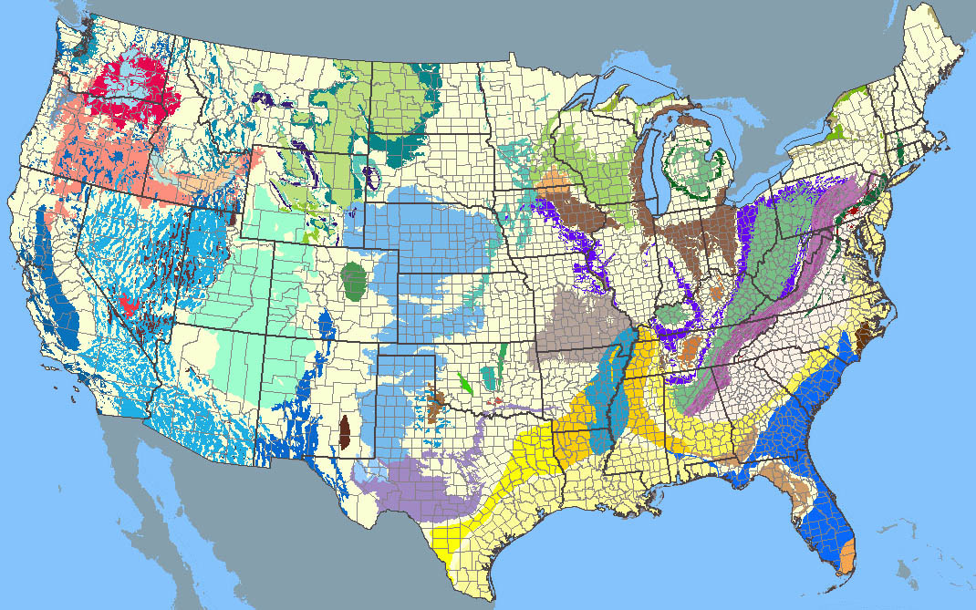
Note: What these maps depict are major aquifer systems. However, there are literally tens of thousands of wells in areas not marked that are suitable for domestic water requirements – capable of producing several gallons per minute. These are shallower system dependent upon the local geology. If there is enough water to support surface streams throughout most of the year – then there is a shallow aquifer system most likely associated with it that can be used. Point of caution is to make sure your sewage is disposed of down hill/ down gradient of your well to avoid pulling the effluent into your water supply.
US Drought Map (live)
Resource Maps (World)
Water
nothing here yet
Credits / Thanks
Too many to mention, but biggest thanks to Ice Age Farmer (Youtube & this Wiki), Adapt 2030 (youtube and everywhere else) and Oppenheimer Ranch Project (Youtube, Facebook) for all the wonderful videos, information, links, resources, maps and more!
External Links (more maps)
Don's Maps has more Ice Age Maps, showing glacial maximum, vegetation, sea level and other features. Source: http://www.donsmaps.com/icemaps.html
More maps and discussion at Watts Up with That?. Source: https://wattsupwiththat.com/2016/12/26/ice-age-survival-threading-the-genetic-and-behavioral-bottleneck/
You can find a temperature / ecosystem biome simulator at Climate Reanalyzer, which you can use to simulate the effects of yearly temperature (say, -3C temperature drop) for glacial areas (area under snow/ice) and biomes (food growing ecosystem) changes. You can do this for various temperature changes, separately for different continents / parts of the world. NB! This is a mathematical model from University of Maine and it cannot guarantee that the results for glaciation / biomes will be what the model predicts, but it can give you some ideas for various regions/areas.